TABLE OF CONTENTS
- Copy-Paste
- Tips for publishing
- Structure your content
- Develop your own storytelling using Minotaur widgets
- Leverage structural content elements
- The right-hand menu on the page
Copy-Paste
Often the content of future pages of a website is first written on a document in a word processor (Microsoft Word or similar). The text is then copied and pasted into the content block. This often leads to a series of problems, both functional and layout-related.
The main reason for this is that usually not only plain text is copied, but a whole layout environment is created.

Copying text will also copy information about the typography used, the font size, the line spacing, the colour, etc. However, most of these elements are not necessary in the environment in which the content is to be pasted. In fact, typography, line spacing, the style of structural elements (titles, subtitles), colour, etc., are already managed by the style sheet (CSS) of your website. It is the style sheet that guarantees your visual identity and a coherent graphic environment.
You should therefore always avoid importing anything other than plain text content.
Tips for publishing
Do not “copy-paste”
The first solution is to write directly in the appropriate blocks: in this way you create or adapt your content to your own environment.
How can you avoid problems if copying and pasting is unavoidable?
If you still have to copy and paste, it is better to use an intermediate tool that does not keep the layout in memory. This could be a plain text editor (NotePad under Windows, TextEdit under Mac), or an HTML code editor (Atom, SublimeText, ...).

Some programs allow you to do a "special" paste that will remove the tags automatically: this is the case of TextEdit on the Mac, with the option "Paste and adapt the style".

Structure your content
The principle of Minotaur is to make the most of the great flexibility given to writers to create attractive, clear (and concise) content, in a word, content that is pleasant to browse. The major challenge is to allow users to quickly "scan" the pages to find the information they are looking for in a minimum of time.
To achieve this, you have two ways of looking at things.
Develop your own storytelling using Minotaur widgets
If you have had the opportunity to participate in Spade's workshops (opens a new window), you will already be familiar with our Minotaur UXKit content templates. These participative workshops can be reorganised internally according to the content needs to be created.

Minotaure wooden blocks, used during workshops
Developing your storytelling requires taking into account a few rules, which help to ensure consistency.
- Create patterns within the pages you develop, i.e. elements that recur regularly and form a "familiar world" where users can easily find their way around. Always start with a hero, for example, and end with a contact form, or consider content that allows users to "bounce" to other pages. Repeating elements (both content and style or layout) helps to remind you of what you consider essential, to highlight expected actions, and to respond more quickly to the expectations of your target audiences.
- Think about the tone of voice on your website. Are you more of a 'you'? The 'you'? Are you friendly, educational or official? Do you identify yourself with a 'we' or with the company name? Do you talk about yourself or do you make generalizations? Etc. Once you have your tone, stick to it throughout the production of your content. If you're not sure what tone to use, base it on your audience: who are they? How do they like to be spoken to? Think about your personas (which Spade can help you define). In any case, keep in mind that not everyone on your site is an expert in your field - in other words, spell out the jargon, use simple sentences, make it simple!
- Do the same for your illustrations, it is also tone of voice. If you use drawings, use the same person for all the images on your site. If you use photos, use framing, subjects, filters (black and white, sepia, etc.) in a unified way.
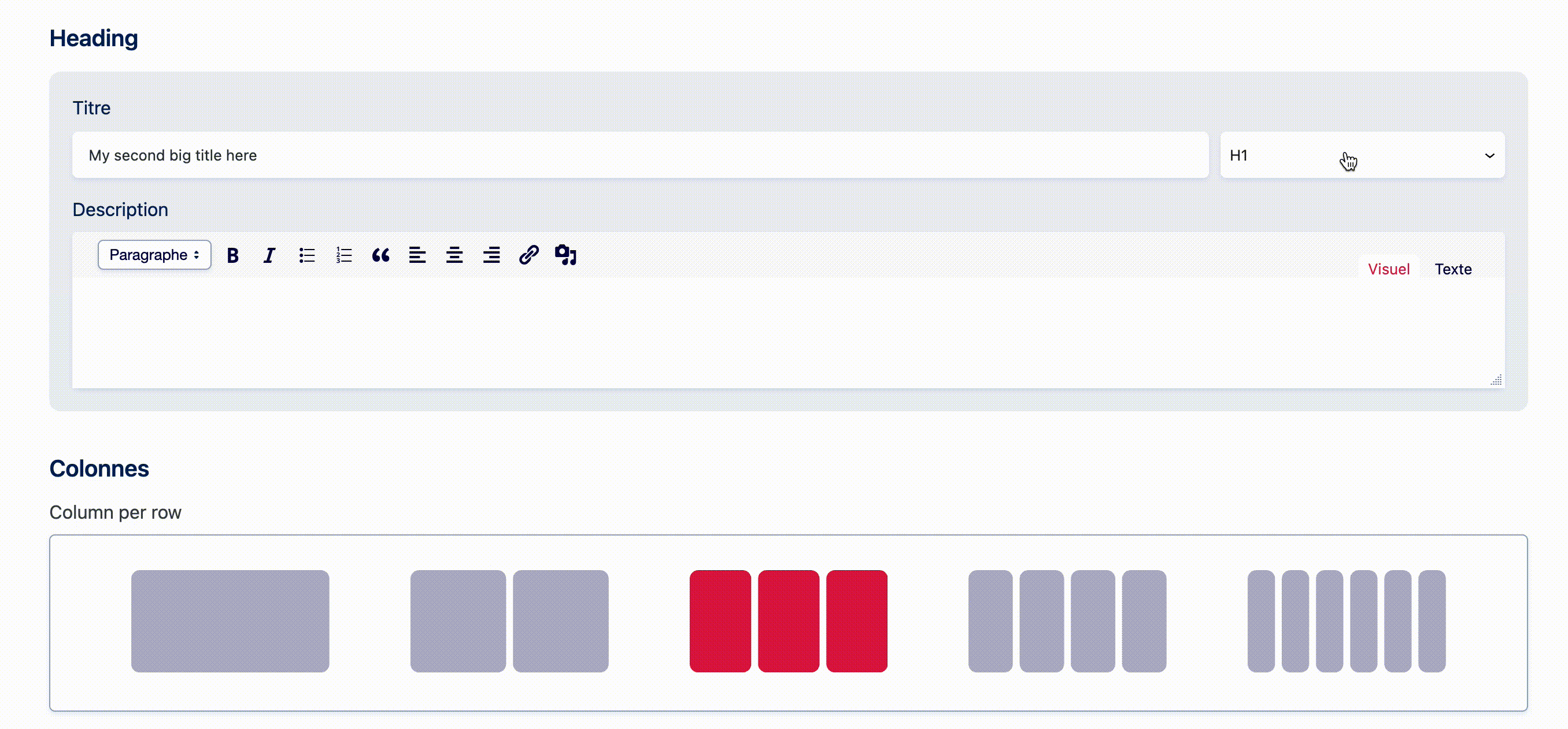
- The right block for the right content! This may sound easy when you put it like that 😃 We know that in practice, the contents are longer and more complex than in downstream validated mock-ups... that's the whole exercise! Synthesise, your readers will thank you. Above all, think about adapting the content to the block and if it really doesn't fit, change the block. With the range of tools at your disposal, there is bound to be one that suits you.
- Think Mobile First : don’t forget that many of your users will read you on their phone...
Leverage structural content elements
- A little preamble: keep it short! We are online, not in a university library, and here readers are used to having everything immediately and without effort. So make it easy for them and if you lack inspiration, put yourself in their shoes: what would you look for on your site? What would you like to see/read/find first?
- Structure your content with headings. You usually have 3 to 6 levels of headings on your website. Make use of them, users will scan your content more easily and quickly.
- Use short labels. A button should not be longer than 3 words. It should only contain one action at a time, which should be clearly understandable and unambiguous. Remember that on a mobile phone, a button that is too long may leave the viewport (= the visible area of the page on the screen).
- Enrichments make reading easier. A bold word, italics, a bulleted list, numbers, etc., are all enrichments that help a person find their marks from page to page. Remember, however, that for headings, quotations, paragraph alignment, etc., a number of parameters are already defined in your site's style sheet - so there's no need to add bold, underline or anything else: it will be done automatically. Your site's style sheet ensures consistency and aesthetics.
The right-hand menu on the page
To the right of the page where your different blocks are displayed, there is a column with tabs that we recommend you not to forget.

- Status and visibility - here you will find information on:
- the author of the page
- its visibility (public, private, protected)
- its publication date
- you can also delete it from here
All items in this list are directly editable here (yes, even the publication date :))
- Permalian
- here you can change the slug of the page (= the last part of the URL)
- and see the page as it appears on the front
- Featured Image - to load a featured image (see dedicated paragraph)
- Extract - this is the few lines that appear below the link in the search results:

The purpose of this little paragraph is purely technical: it feeds your SEO (= your natural referencing).
For example: you have created an "About" page that explains who you are with 5 different widgets (Hero, columns, list of partners...). The content of the blocks is part of your page and will be indexed by search engines. The snippet improves the internal search of the website (when you use the internal search engine of WordPress), and highlights this content on your social networks and in Google results.
- Comments - allow or not allow contributors to your site to leave comments on a page
- Page Attributes - here you can define :
- the parent page of the current page (if required)
- the order of the page in the listing (remember, for Children's pages this is useful!) see article on this subject
It is also in this right-hand bar that you will find the language for multilingual sites.